BANJALUKA TOURISM ORGANIZATION UNVEILS NEW VISUAL IDENTITY
The Tourism Organization of Banjaluka (TOBL) has officially introduced its new visual identity, featuring symbols that highlight the unique charm and heritage of the city on the Vrbas River.

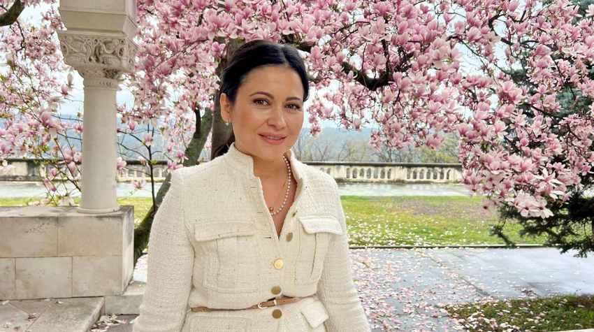
The new identity aims to represent Banjaluka in its best light, showcasing the city’s recognizable and distinctive landmarks. Dragana Vukliš, Director of the Tourism Organization of Banjaluka, proudly presented the new visual identity on Monday.
"This rebranding is not just a visual change but a symbol of our city. The elements incorporated into our logo represent the most significant symbols of Banjaluka," said Vukliš.
According to her, the organization's new visual identity follows two directions, featuring two logos.
"We have our official corporate logo, which symbolizes professionalism and stability, and our tourism logo, which is vibrant with colors such as yellow, orange, blue, and green. These elements beautifully reflect the spirit of Banjaluka," Vukliš explained.
She emphasized that the symbols in the logo carry deep meaning. The traditional dajak boat represents the city’s authenticity, while the Kastel Fortress symbolizes its historical heritage.
"Additionally, the Zmijanje embroidery showcases our rich cultural legacy, while the chestnut leaf represents the natural treasures of our city," Vukliš added, as reported by Nezavisne Novine.
On this occasion, Vukliš extended her gratitude to all collaborators, colleagues, partners, and the creative teams involved in the development of the logo.

Join our
Viber Community

COULD EUROPE SOON FACE TEMPERATURES ABOVE 50°C?
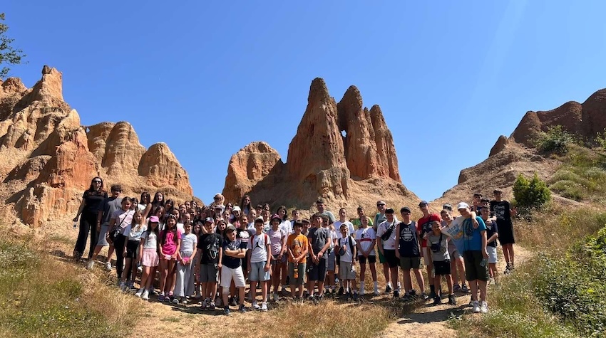
CHILDREN FROM KOSOVO AND METOHIJA DISCOVER THE NATURAL BEAUTY OF FOČA
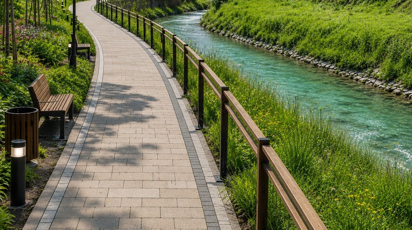
CALL FOR CONCEPTUAL DESIGN PROPOSALS ISSUED FOR PROMENADE ALONG THE PALJANSKA MILJACKA RIVER
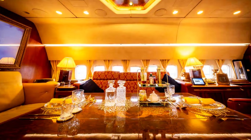
PABLO ESCOBAR’S FORMER AIRCRAFT TRANSFORMED INTO A LUXURY AIRBNB RETREAT
WHAT TO EXPECT FROM THIS YEAR’S “PRKOS FEST” IN DERVENTA
WHAT TO EXPECT FROM THIS YEAR’S “PRKOS FEST” IN DERVENTA
MINJA ŠURLAN: SUMMER ON THE VRBAS 2026 BRINGS A PROGRAM REVOLUTION AND A MONTH OF ENTERTAINMENT FOR ALL GENERATIONS

OFFLINE DAY IN BANJA LUKA – MARBLES, NOT CLICKS

FROM SWIMMING TO A MASSAGE ON A RAFT: BOČAC OFFERS AN UNFORGETTABLE ESCAPE
CALL FOR CONCEPTUAL DESIGN PROPOSALS ISSUED FOR PROMENADE ALONG THE PALJANSKA MILJACKA RIVER

 The situation at the border crossings