TOP 3 COLOR COMBINATIONS FOR A LIVING SPACE
The choice of colors is one of the key elements that defines the spirit of an entire home. Colors have the power to transform the atmosphere, influence our mood, make a space feel larger or smaller, and sometimes add a touch of elegance or playfulness. With the right palette, you can refresh your home without additional renovations or major investments.
Besides
choosing shades that suit your personality and lifestyle, it is equally
important to combine colors properly. Some colors simply do not work well
together and can feel overwhelming to the human eye, while others create
combinations that instantly look stylish and harmonious.
The
right colors can work wonders even in the simplest interiors. According to
Zadovoljna.hr, some color combinations rarely fail. Among them are beige and
ochre, which create a refined and natural look; red and purple, which can
energize any room; and blue and brown, a duo that radiates natural balance and
positive energy.
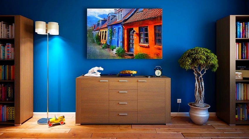
Light Blue and Brown
If you
are not a fan of bright and bold colors, this combination could be the perfect
choice. Light shades of blue paired with brown—often appearing through natural
wood tones—create a calm and natural atmosphere.
This
pairing is ideal for people who want to introduce color into their home without
experimenting too much. The duo creates a feeling of freshness, tranquility,
and natural balance. It is also highly practical, as it blends easily with many
other colors, even those outside the neutral spectrum.
Design
experts often recommend this palette for kitchens, living rooms, dining rooms,
and even bedrooms. It fits well with a variety of interior styles, from
Scandinavian to Mediterranean. For the best effect, brown tones should appear
through natural materials such as wood.
Red and Purple
At
first glance, this combination may remind some people of early 2000s design
trends. However, red and purple together can create a striking and dramatic
interior look.
This bold
pairing is usually chosen by those who are more confident with color. If you
are just starting to experiment with color in your home, this combination might
be better used cautiously.
Red
brings passion and vibrancy into any space, while purple adds depth and
sophistication. Together, they create a dynamic and eye-catching contrast
Because
these colors are quite intense, designers recommend using them in spaces where
you do not spend long periods of time, such as bathrooms, or incorporating them
through smaller details. Wall art, decorative pillows, blankets, or small
ornaments can introduce these tones without overwhelming the room.
Ochre Yellow and Beige
Ochre
is a rich shade of yellow that has remained popular in interior design for
years. When decorating a room, it is often recommended to soften this color by
pairing it with cream or beige tones.
Ochre
adds a sense of elegance to any space, while beige creates a soft and visually
pleasing harmony. Because this combination is refined yet subtle, it works well
in rooms where people spend a lot of time.
Beige
and ochre are especially suitable for bedrooms, living rooms, home offices, and
other areas that benefit from a warm, calm, and sophisticated atmosphere.

Join our
Viber Community

HOW TO FIGHT INSOMNIA: UNDERSTANDING THE CAUSES, SYMPTOMS, AND TREATMENT OPTIONS

NATURAL OASIS NEAR GRADIŠKA READY FOR THE SUMMER SEASON

MTB TOUR – A CYCLING ADVENTURE ON BORIKE

NINTH FESTIVAL OF DOMESTIC PRODUCTS AND SERVICES RETURNS TO ITS ORIGINAL VENUE
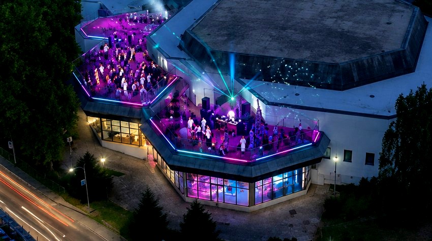
"PARKIĆ PARTY" BRINGS ROOFTOP ENTERTAINMENT TO BANJA LUKA'S YOUTH CENTER

CLASH OF CONTINENTS AND CULTURES: BRAZILIAN WOMAN GABRIELA FINDS LOVE IN BANJA LUKA
NINTH FESTIVAL OF DOMESTIC PRODUCTS AND SERVICES RETURNS TO ITS ORIGINAL VENUE
MTB TOUR – A CYCLING ADVENTURE ON BORIKE
"PARKIĆ PARTY" BRINGS ROOFTOP ENTERTAINMENT TO BANJA LUKA'S YOUTH CENTER
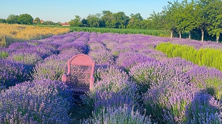
FROM AGRICULTURE TO TOURISM: LAVENDER FROM SEMBERIJA IS BECOMING A BRAND


 The situation at the border crossings